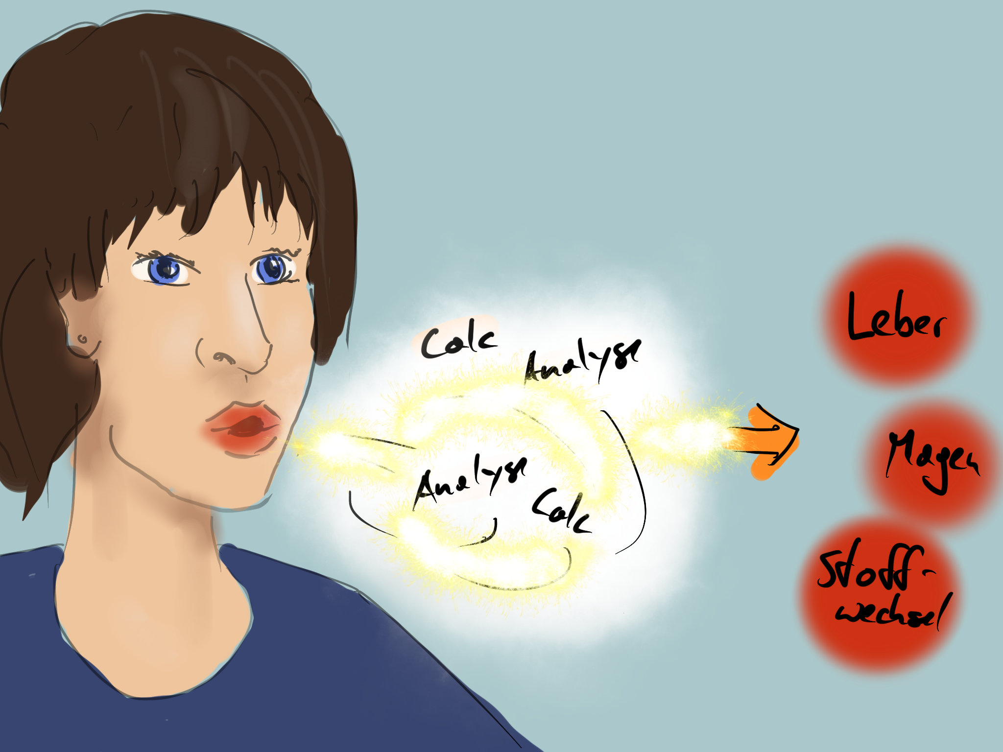
After getting into the subject of the publication MedicalGraphics made some suggestions for possible motives. Quite quickly, the depiction of an exhaling human figure in close-up crystallized as the ideal motif. The breath should then be presented with graphical elements that visualize the analysis of the elements. In the last step, the diagnosis should be visualized.
Scetch cover
When creating the designs, the three-level illustration (breathing person> breath analysis> diagnosis) would clearly lead to a more schematic design of the cover. Since the cover should not really transport the individual steps of the process, but should simply introduce the subject in an appealing and descriptive way, the last step “diagnosis” was abandoned. This reduced the essential design group to the breathing person and to the analysis of the breath.
In this process, it became clear that a more subjective and emotional visualization of the theme for the cover would be good. As a result, we decided to skip the development of a 3D character and build our illustration on a photo (which is often better able to transport emotions). During the research it became very difficult to visualize an essential part of the illustration: the breath. Although an exhaling person could be identified as such, the invisibility of the breathing was a major shortcoming. We solved the problem by opting for a wintry picture with visibly condensing breath and additionally floating snowflakes.
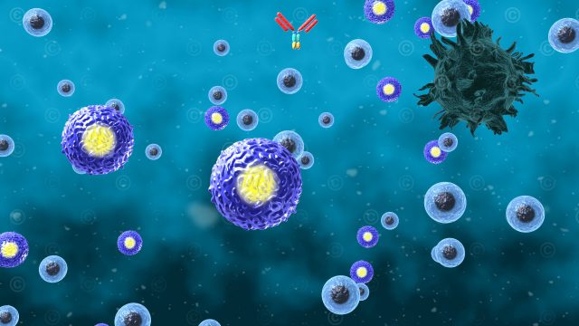
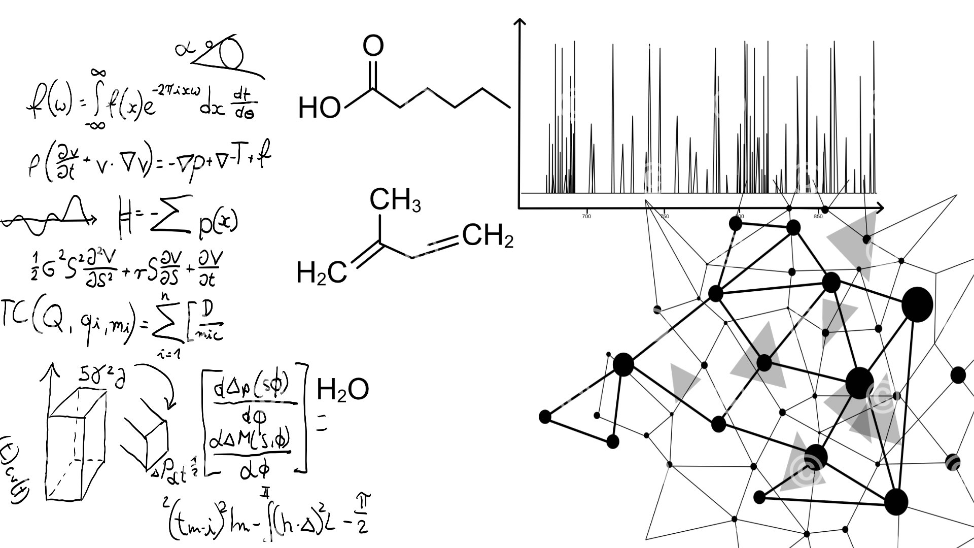
After selecting the underlying photo, we explored the visual elements of the analysis. For this purpose, we designed a netlike node structure and a collection of formulas to transport this visually. Another important aspect was the mass spectrometer. The most characteristic of this process seemed to be the presentation of the results of a measurement in a diagram and additionaly the visualization of the most frequently detected molecules.
Ements cover
In the next phase, a first draft of the illustration was created. In order to visually support the analytical process, we decided to use a reduced and thus somewhat abstract color world and to design the two areas person / background and analysis in two separate, complementary colors. To define the color world we created a series of designs.

First draft – Color Variation Blue / Yellow
The first draft made it clear that the image area “analysis” lacked substance. The idea to visualize the abstract process of the analysis only by schematic lines led to the actual focus of the illustration be “flat” or “undesigned”. It also seemed a bit too chaotic due to the many lines. We decide and subsequently give the elements a greater depth with transparency and thus avoid too much overlapping. In addition, we designed the molecules that are analyzed no longer as structural formula but as three-dimensional molecules.
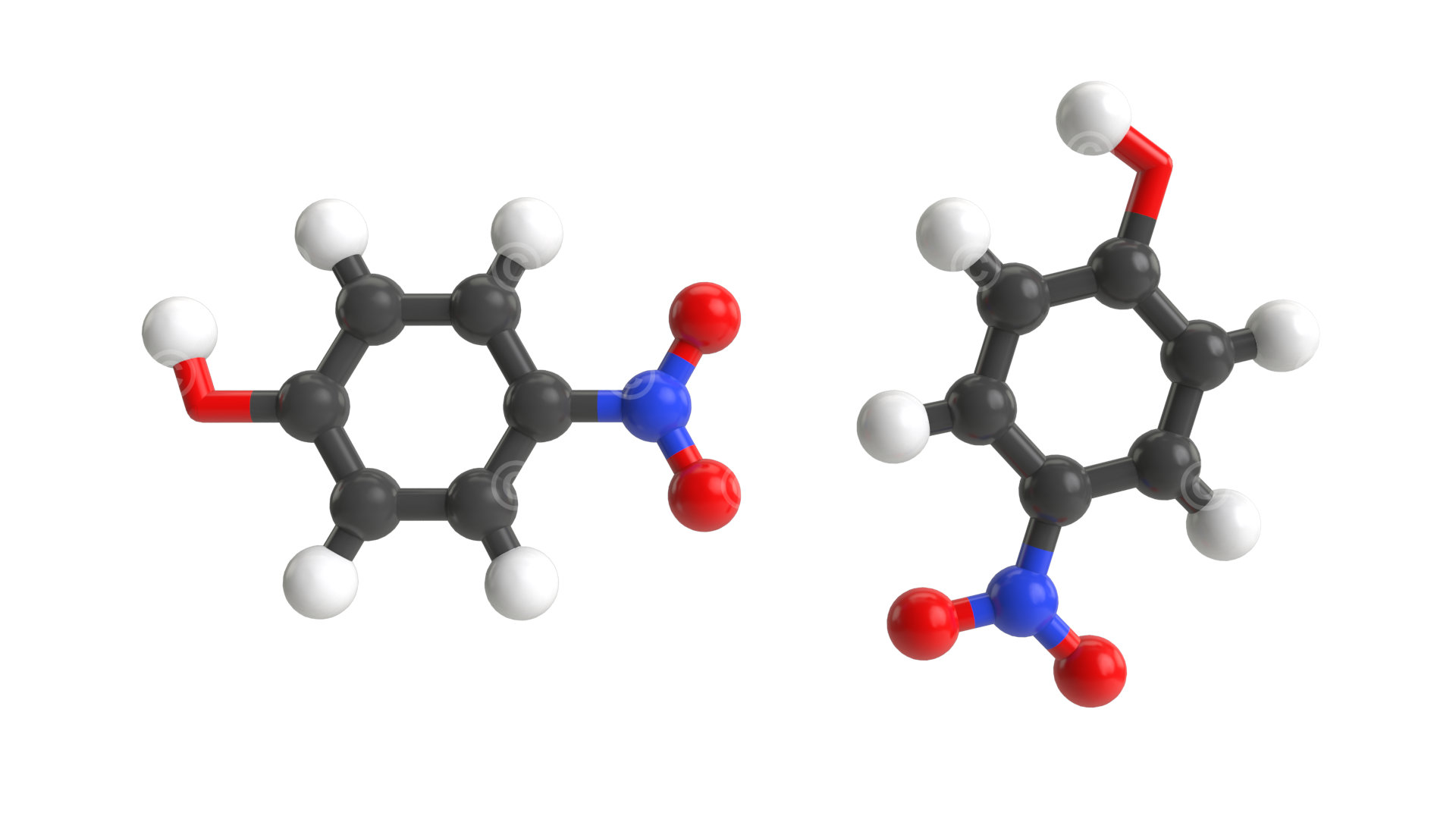
3d illustration molecule
In the final step, the color world was finally determined, some image areas retouched in the photo and the modified 3D molecules integrated. With transparency and depth of field the composition of the elements of the “analysis” was finally finished and the high-resolution version of the illustration was created for a printable cover.

Finales Cover “Chemical Review” zum Thema “Atemanalyse”